06 Jun Advice for rich guys buying Bugattis
Posted from Seattle, WA, June 6, 2013
I’m running an ad in the Seattle Times on Friday, June 7 in the A-section that criticizes the styling of a $2.5 million sports car, the Bugatti Vitesse. Did someone just snicker and did I hear the word “envy?” I’ll address that later, but, regardless, the ad goes on to advise people to buy the beautifully-styled Tesla Model S instead of the Vitesse and put some of the savings toward the World Land Trust-US. It specifically touts a project of the WLT-US that would purchase a key ranch in Ecuador for a little over $200,000 that is critical to the survival of that nation’s Andean Condors.
Here is a shot of a Condor in the Andes from WLT-US and here is a link to their website.
The Ranch is very close to Quito and perfectly suited for eco-tourism development so the people of Ecuador can protect and enjoy and profit from one of the iconic critters of the Andes.
Here is the link:
Maybe Seattle can stay on the WLT-US funding map. It was the top US city per capita last year in donating funds to this tiny but very effective organization that helps local conservation groups in the Americas secure critical lands to help avert imminent extinctions.
BTW, No, I absolutely don’t think the ad will have the intended effect, and no, I don’t think anyone who is going to buy a Vitesse will even read it or even makes “choices” between sedan and a sports car (and, yes, some slight level of humor was hoped-for.) I also think some of the rest-of-the-folks out there who are not in the Vitesse-buying demographic (I own a Geo Metro, so include me in that) will question my central thesis, that the Vitesse isn’t good-looking. No doubt, if a car is going to have that kind of performance (255 mph), the engineers had to have veto-power over the stylists whenever they collided, so appearance could never be a stand-alone goal in the design of this car. But still, Tesla S had to meet engineering criteria and it succeeded while this car is a styling nightmare.
In that judgement, I’m in clear disagreement with Peter Valdes-DaPenna who writes in his CNN Money blog that the Vitesse is “A work of art – With its elegant yet muscular shape, the Veyron is pleasing to the eye and elicits a subtle mix of emotions, not least among them envy.” (It’s impossible to convincingly deny envy. But for me the car itself creates no such emotions while the $2.5 million in disposable income it takes to buy it creates quite a bit.)
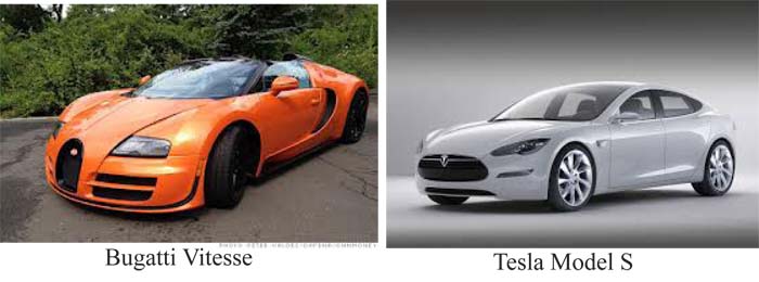
Here is a shot of the two cars side-by-side, with photo-thanks to Peter Valdez-daPenna. Notice the clean gorgeous lines of the Tesla, and compare them to the herky-jerky look of the Bugatti. The Vitesse looks like a kit car whose various body pieces are built to snap together, with latitudinal lines interfering with its longitudinal continuity and destroying what mealy amount of sweep this stubby car can muster. The air scoop on the sides has a nice curve to it, but that curve doesn’t have any coherent relationship with the rest of the lines. The high front wheel wells were probably an engineering necessity but they torture the car’s appearance, as does the cheap-looking flattening of the body over the wheel wells. The grill is a hideous mixture of Old Bugatti with a funny-looking Bugatti insignia oddly placed right in the center. Next to this attempt to look retro are parallel rectangular slits that look like they made with a Makita. Compare that to the front end of the Tesla, the most beautiful front end of any car of the 2000s, in my (humble!) opinion.
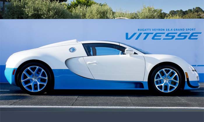
This side view of the Vitesse from Autoweek shows some of the problems. It looks like a kid’s jigsaw puzzle. The air scoop line draws your eye down and leftward along the body, emphasizing the feel of speed. Then the line, instead of making a beautiful s-curve and continuing on its way, does a 360 and sends you back to the right, with the visual implication of saying: “This car is going nowhere.”
Here is one more shot of the beautiful Tesla Model S, so I can end this blog on a high note. Notice the S-curve, and how, unlike many cars these days, the S looks as good from the rear as the front.
text copy of ad:
Advice from an artist to Bugatti Vitesse buyers
People who are planning to buy a $2.5 mn Vitesse probably have been captivated by the brand name, the 1200 hp & 255 mph, & may not have noticed it’s kind of junky-looking. Why not instead buy a car w/ gorgeous lines, like a Tesla S, and put some of the savings toward a World Land Trust-US project? One that’s current would help purchase a $200 K ranch in Ecuador that would serve to protect that countries’ Condors while creating a wonderful eco-tourism site for locals and tourists. & it’s easy to donate at: World Land Trust-US.org


Sorry, the comment form is closed at this time.