02 Sep Southwest portraits, plus more reworking
Posted September 2, 2015 from Seattle, WA
I had that vision of a medium-sized Southwestern Bird Skinny when we were in Rodeo and it seems to be humming along. This will be 6 x 18” trim-size skinny and it will no doubt open a Pandora’s Box (is that sexist imagery?) because it may well look pretty good and I’ll have to do every other of the more than 20 other skinnies in that size also. That’ll be fun, but there’s no room in the basement to store them.
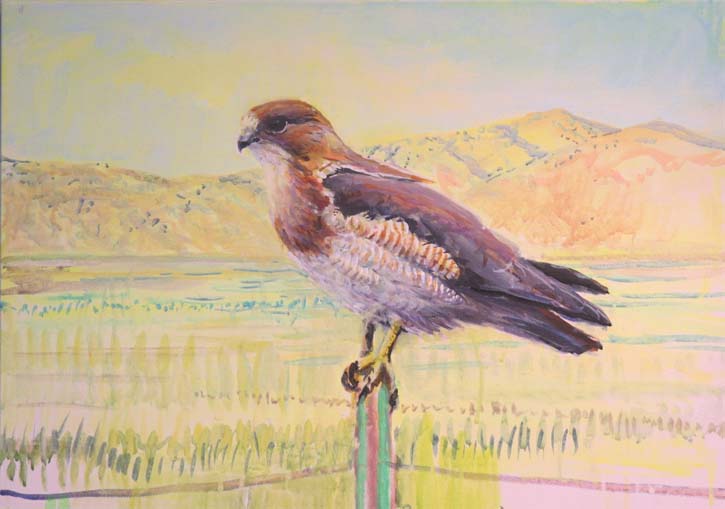
The Swainson’s Hawk is a Western bird as well as a Southwestern Bird, but it’s a major presence in the SW landscape, so it qualifies. I like this so far.
The Gambel’s Quail, which was up on my previous blog post, is coming along ok. It’s sitting on a spent Agave.
Ditto the Vermillion Flycatcher, but it is in more need of work. Vermillion Flycatchers, unlike some of the other very colorful birds of the Southwest, aren’t hard to see, in fact they are almost in-your-face– I wonder if they even associate people with safety in some way? Anyway, it makes them a good choice for the skinny.
This is an old painting I got out and am working on. Bridled titmice tend to show up at feeders, so it’s a good choice. I’m having a little trouble with the Alligator Juniper tree, but who wouldn’t?
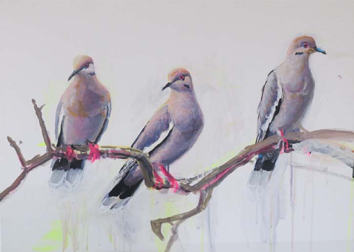
This is the species that inspired the project. There were three White-wings crammed on to a nearby branch and I thought, “Oh well, might as well take the shot if they are going to be that obliging.” Looking at the shot I realized what others before me have also realized: White-winged Doves are beautiful! And of course, the pride of Texas.
I’m not going to try to sneak this Chinook Salmon into the SW bird skinny. I reworked it recently but have not yet got a print that looks right. It will be at the store as soon as I do.
Wow, the garishness must be because this image is in CMYK rather than RGB. It doesn’t look like this, it looks like everything else. I recently have reissued a new version of Hummingbirds of Costa Rica. The painting was reworked on the computer because the gouache original is flaking beyond repair. Here’s what the new image looks like, it also features numbers on the image that make it easier to use.
I have also had great difficulty working on this Orca painting. Blue pigments are the worst to work with of all colors. The painting is on museum board and it refuses to accept more paint. I like the way the Orcas look, but I’m having trouble with the color of the water, too unsubtle right now and I’m not sure what to do about it. Still, I regard it as an improvement over the previous version, but just by an inch.
(sorry comments are turned off because of spam. I would love to post your comment, but unfortunately I must ask you to alert me that you have made one. Email me at ednewbold1@yahoo.com and I will turn on your comment immediately.)


Sorry, the comment form is closed at this time.